Saturday, 19 December 2015
Friday, 18 December 2015
Thursday, 17 December 2015
Colour Scheme Ideas, Name Ideas and Feature Story Ideas
Colour SchemesLooking at these magazine front covers, I notice the use of primary colours is quite common. This is probably due to the way in which they stand out, and how bold they are, as well as how they contrast the background. The majority of front covers have white backgrounds, though some are coloured - through observing the Rocksound front cover, I can see that the background colouring has to be light, otherwise you'd be unable to read the text very well. Based on my survey results, and the information I have required through secondary research, I have decided for the main colour of my magazine to be a dark red, which will then be complimented by black and white. I think this will work well, as it is simplistic and bold, and the colour won't draw attention away from the focal point of the cover (the artist). Name Ideas
I decided to base my names around insanity, as rock music is often described as quite crazy, and can be associated individuals who are famous because of the way in which they seem slightly insane. The other names that I came up with are all heavily onomatopoeic based, meaning that when said aloud, they mirror noises that can be made by instruments when they're played. I decided to go with the name, 'Clash' as it's quite short thus it's easily memorable, and it reminds me of the sound made by the symbols on a drum kit. I think that drums are often associated with rock music, hence when my audience read the title, they will be able to detect the fact that the genre is rock.
Feature Stories
Having looked at a few magazines such as Kerrang and Rocksound, I can see that common stories seem to revolve around tours, or new artists releasing their first album. 'Exclusive Interviews' are also popular, and so when coming up with my feature stories, I decided to include some of these typical stories.
I would also include a section on fashion, and a competition, as these are common features in magazines.
|
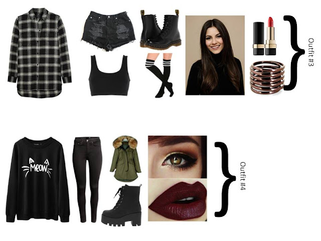
Costume Designs
I have chosen to try and recreate outfits such as these for my shoot, as the colours are all quite dark and 'grungey'. The use of current trends would possibly make my product appeal to my target audience of adolescents, as they would be able to relate to artists wearing clothes such as these. Also the outfits wouldn't clash too heavily with my colour scheme, making it easier to place text and such on my front cover, contents page, and double page spread.
Contents Page House Styles
I chose to observe Kerrang's contents page, as it is a rock magazine, which is the genre I have chosen to focus on for my project. Looking at this collection of contents pages, I can see that headings tend to be in bold to emphasise their importance, and make them stand out to the reader. They are also highlighted by a coloured background. The headline story has been allocated the largest image to show readers that it is considered the most important, and probably took the most effort to put together. Underneath the main stories, there are small overviews of what the stories are about, or quotes pulled from the interview. These may be used in order to grasp the audience's interest, and encourage them to look at those stories first. Images are also used in order to give the reader an indication of what kind of mood the article is written in. In each contents page there is a subscription advertisement, which may be placed strategically in order to persuade the audience members to purchase numerous copies of the magazine in advance. An editor's note is also included, perhaps with the intention of making audiences feel as though they were included in the making of the final product.
Subscribe to:
Comments (Atom)


